After reading the morning news, I have been anxiously waiting for Google Chrome. And finally, the not-so-long wait is over. You can download Google Chrome here: http://www.google.com/chrome/
Sadly, there seems to be some issues with Google Chrome’s download page in Firefox and Chrome itself! In case you are unable to download, try downloading in IE.
Here is my point by point first look / brief review.
-
First of all, the download process sucks. I hate these Internet based installations, reminds me of the dreadful Kazaa days.
-
Installation
Looks neat and self explanatory.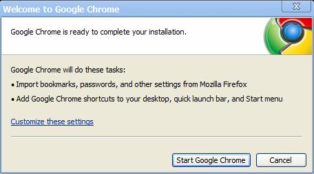
Let’s customize it.
– Import (IE/Firefox both): Check.
– Default browser: Hmm, let’s wait for you to prove you mettle.
– Shortcuts: Well, good enough. Google has made sure you won’t forget Chrome easily.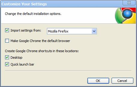
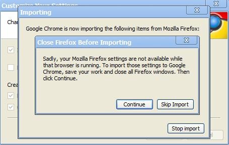
Yay! The first warning. Is it me or 3 stacked windows look like clutter?
Anyway, I’ll close Firefox. -
Start page look and feel
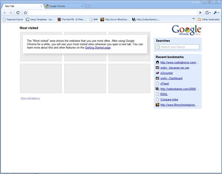
Well that was quick. Now, let’s look at what we have here. (Click on image for detailed screenshot)
It doesn’t fit by default to my widescreen. Anyway, the UI looks really smooth and polished. But it looks very non-windows like. So already, Firefox 3 is ahead in the sense that it gives you the look and feel of the base Operating System 🙂
Let’s zoom in to the features one by one:
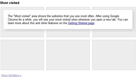
Most Visited:
Opera wannabe. Not bad, although I’ve always preferred a blank homepageSidebar:
Now this looks good (and useful). Search history and recent bookmarks. I hope they are customizable.
What! No auto-complete in search. Oh come’ on Google.OmniBox (Address Bar): I am expecting improvements over Firefox’s awesome bar.
What the hell is it trying to do here? I think it’s directly searching my name on Google.
Let’s see what Firefox does:
Well, this is much better. It lists my recently visited websites with my name as header. Since Google has this history information too, it should have performed better.
This also means that there is no separate Search Bar. Sucks!In another test Google Chrome refused to list Google Chrome homepage even though it was opened in the next tab. I agree that separate tabs have separate processes but whatever happened to Inter-process Communication?
So as of now, Firefox’s Awesome Bar is better than the OmniBox. For rest of the look and feel I like Chrome but mainly because the Windows XP UI is pretty old and boring.
-
Browser features
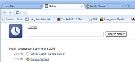
History:
Oh, History is a tab not a dropdown. I hate this. Why would I navigate to another tab to look into the History ?
Otherwise, it looks good and search works perfectly. Just like Google Desktop Search. Firefox does the job as well. It’s more or less a tie, except for those like me who hate the separate tab for History.Bookmarks:
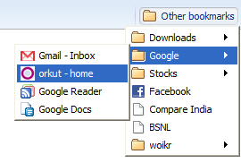
Well, this is good. A dropdown as it should be.
But wait, I can’t click the middle mouse button to open all links in a folder. Heck, there seems to be no way to do this. Adding a bookmark is exactly same as Firefox 3. I can’t find any Bookmarks manager though, strange! The editing is really trivial, no options at all. But it isn’t bad.
Overall, It seems Firefox wins again, marginally this time though.Downloads:
I have high aspirations here. I just hate how browsers handle downloads.
Aargh! struggling again to reach Google Desktop’s download page. It’s final. I hate OmniBox.
Anyway, download starts with a cute animation and a new download bar pops up in bottom. Pretty nice.
Oh, I can’t right click the download box, I have to explicitly click on the arrow next to it. No problem, there you go.I see no Pause button. No problem again. I’ll open the downloads tab (linked on the right of the Download bar).
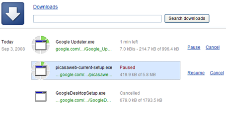
Here’s the Downloads tab. It looks really good. Better than the Firefox popup.This Downloads UI is not really polished. No multiple select possible. No “delete all downloaded/canceled” options. And the right click is not natural. Makes me realize that this is a web-app not an actual application. Oh yes, no clean download progress bar too!
Also, I can’t resume canceled downloads. So cancel is like the never-press-me button.Anyhow, the Downloads tab looks promising. I’m sure they can fix these small issues in later releases.
Search in page:
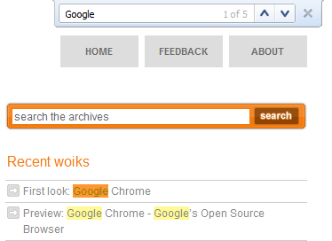
Works exactly like Safari. I love it. I always wanted Firefox to have this.File menu:
Doesn’t exist. Just a small dropdown on right with common options. Learnt from IE 7 and improved tremendously. I love this too.Recovery features:
I closed a full window with 12 tabs and it didn’t warn or anything. There was no restore option when I opened up again.
But when a Chrome window crashes, it asks you to Restore from the backup it has made. Just as expected. Firefox wins by a little margin.Status Bar:
I love the status bar that appears only when required. The more screen estate, the better. Especially for widescreen displays.Incognito:
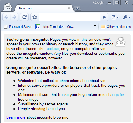
Now this sure is a cool new feature. Open a new Incognito window and browser won’t any history for this particular window. So now you don’t need to clear the you-know-what history every time before someone uses your computer. - Browser Options
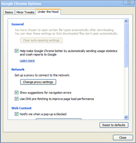
The option screen is very similar to Firefox 3, except some re-arrangements. I can see that they’ve done this to make it easier for the non-technical crowd. It works well too.
But the geeky crowd will find this new arrangement clumsy. - Performance
This is something which everyone hates about Firefox. The extreme memory footprint. And Google Chrome really trumps Firefox in this category. As expected from the new architecture, the sluggishness is non-existent. With as many as 10 tabs (including 3 long flickr pages full of images) Chrome works smooth. The only noticeable lag is in rendering, which seems to become slower as we open more tabs. This is expected due to the multiple processes running in parallel and is pretty reasonable.
Also, either I am too sleepy or I can actually see the rendering process switching contexts between tabs. Please confirm if you feel that too (Only visible when lots of tabs are open).To top it all, Google Chrome consumes much lesser memory than Firefox with same no. of tabs (with same content) open. In my tests it’s almost 30% lesser with around 10 tabs open.
And yes, it shows multiple process entries for each tab (as expected), so it can be a bit confusing. When, say you want to kill a certain process, but can’t because all processes are called “chrome.exe”.

- Conclusion
That covers everything I found interesting about the new Google Chrome. It sure has it’s issues and I won’t be switching from Firefox anytime soon. But all these issues are very fixable. Once Google irons them out, Chrome will undoubtedly jump ahead of the competitors. After all, it is built on an amazing design and foundation.
Without doubt this is Google’s best product announcement since a long time.






15 responses to “First Look: Google Chrome, the Google Browser”
Nicely drafted details, should have included the details about Developer's section (JS console, perfomance measures of every JS executed) and Task Manager in Chrome.
Thanks for the comments, Prakash.
I'd plan to do another developer review, but, only if I find enough interesting features 🙂
Excellent Chirag This was really helpful. Google is talking a lot about security in Chrome, hope you will include security also in your another developer review.
Hi there,
Nice article, especially for me since I couldn't try it out yet. Compiling the chromium source in Linux gives me the worst nightmares. But those things aside, is it true that if I post an article to my blog through Chrome and I by chance happen to be the next Anil Dash in the making, Google can straight away rip off my article without even attributing and post/modify/do whatever it wants to my post?! That's crazy ! My current browser doesn't have a similar weird terms of service! lol!
@Sandeep: Thanks. Now that the demand is coming in, I'd probably prepare a more technical article about Google Chrome.
@Bandan: Thanks and welcome. Believe you me I' was really surprised to know that Google didn't release Mac/Linux versions simultaneously.
And as far as the article ripoff issue is concerned all that comes to my mind is that imitation is the best form of flattery 😛
Update: – Matt Cutts from the Google SEO team clarifies these doubts. Have a look.
Whoa – each tab a different process ? Windows actually boosts the prio of a process (which changes the prio of its threads http://msdn.microsoft.com/en-us/library/ms685100…. when that process comes to foreground http://msdn.microsoft.com/en-us/library/ms684828(… . With multiple tabs open in a browser and a user alt+tabbing quickly between those, other (< 16 base prio threads) will go for a toss 😛 .. as against a single process which would have owned tabs per thread.
I'm sure due diligence has been done not to hog the processor – will try to validate and post some experimental results with perfmon – or this comment will stand deleted 😛 ..
@Vivek:
It isn't as big an issue as you think. Just compare "a process for each tab" to the IE6 (and before) model where each tab was a window. And each window/instance had a process.
Tabs exist only for convenience. Not because they are light on CPU.
Although I agree that context switching between processes will be an overhead for sure.
But in practicality browser based CPU hogging is caused when rendering huge images/java/flash or other such plugins. In this case it's better to have 1 tab being stuck rather than the whole browser (with all tabs) being stuck.
What do you think now?
My point was a bit different. Will discuss (in detail) and revisit 😛
>> Update: – Matt Cutts from the Google SEO team clarifies these doubts. Have a look.
Whatever he may say, it's __not__ a doubt and so there's no point of any clarification. The clause was outright outrageous and they had to fix it (which they did!). So, all I am saying is it was not a doubt, it was a __mistake__ 🙂
@Bandan,
Here's a post from the Google Blog. They are really explaining themselves.
@Chirag,
For IE6 and before, you told that "each tab as a process", however my understanding was that the separate windows were different processes, however tabs inside window are threads and thus lightweight.
So, chrome was designed as "multi-process" as opposed to "multi-threads" for different tabs. Can you please clarify?
@Prakash:
What I meant (and probably said) was that IE 6 had no concept of tabs. Hence it was as bad / as good as 1 process for each tab concept.
Also, I believe each tab in Firefox isn't a process. I think a thread should be (and probably is) much smaller than 1 tab, say 1 thread for rendering the text, 1 for loading images, 1 for processing flash, 1 for I/O etc etc.
This is all what I think. I'm not sure if it IS a fact so, don't quote me on this 🙂
Chrome has 'over killed' the multi-processing. It seems they started implementing it before Firefox's multi-tabbing became popular 😉
Btw, I don't buy if they say it's 'faster' or 'smoother' or 'lightweight' because of multi-processing because that is against principles of computing.
It's is true that Chrome is fast in executing Javascript, but that is not something achieved due to multi-processing.
[…] [upmod] [downmod] First Look: Google Chrome, the Google Browser (woikr.com) 4 points posted 8 months, 1 week ago by swaroop tags chrome google browsers […]
[…] Here’s our review! […]